Building Imagery and Simulation

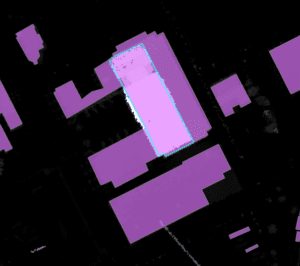
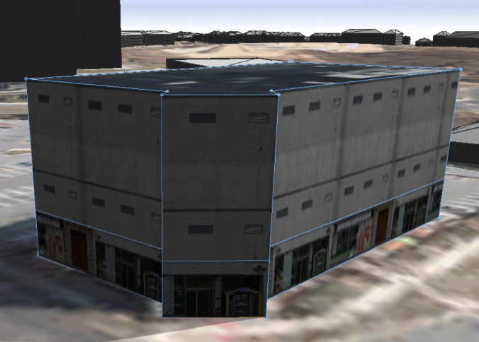
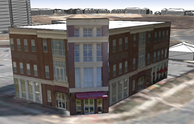
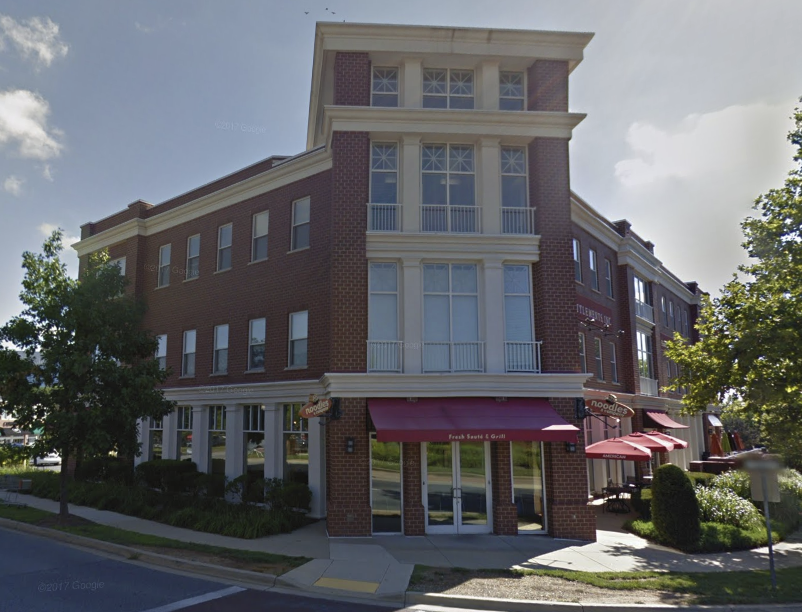
There are times when generic building models need to be upgraded to give a better representation of what is actually there. This may be useful for “hero” buildings that are immediately identifiable, or perhaps an area that has planned redevelopment activities taking place. Fortunately, adding custom texture in Esri’s CityEngine is a relatively straight-forward process. In the following example, a building is generated from LiDAR, slightly modified for a complex roof, and then ground photography is mapped as a texture onto the building. Before and after textures are shown below, with the actual building shown in Google Streetview for comparison.

generic building

textured building

google streetview

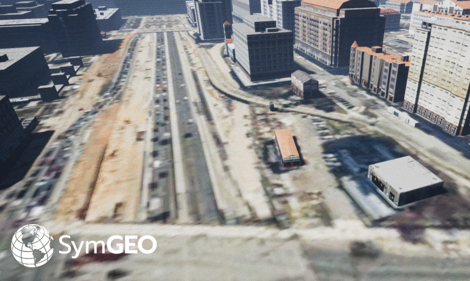
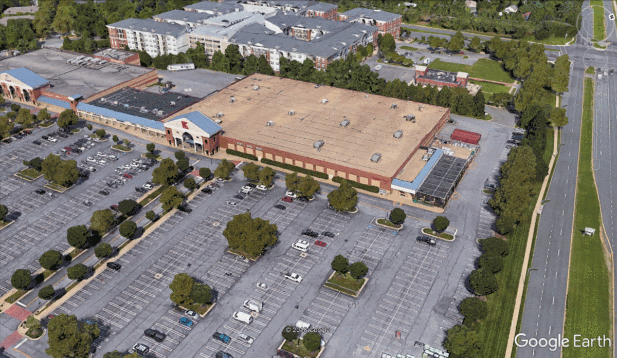
Another method of adding realism to a presentation is to use the Google Earth platform to capitalize on all of Google’s ground-based LiDAR information and photo mapping (where available). When combined with new building models and a little Photoshop, compelling before-and-after scenarios can be explored in a very cost-effective manner. This example shows where a Kmart complex may be replaced by a high-density residential building.

before-and-after simulation

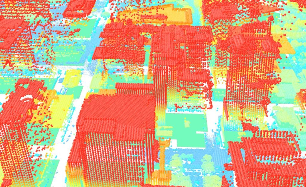
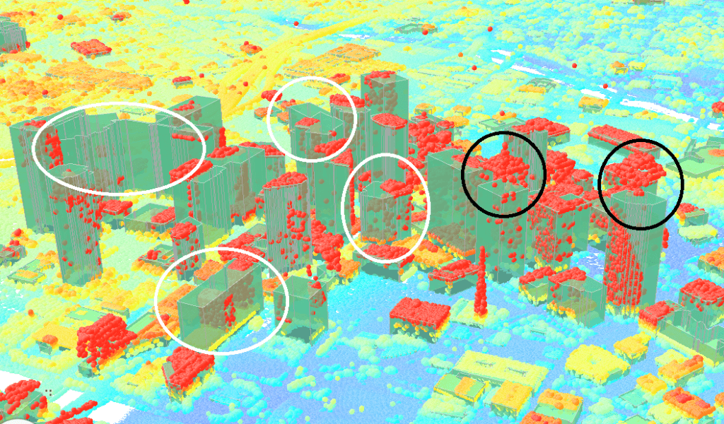
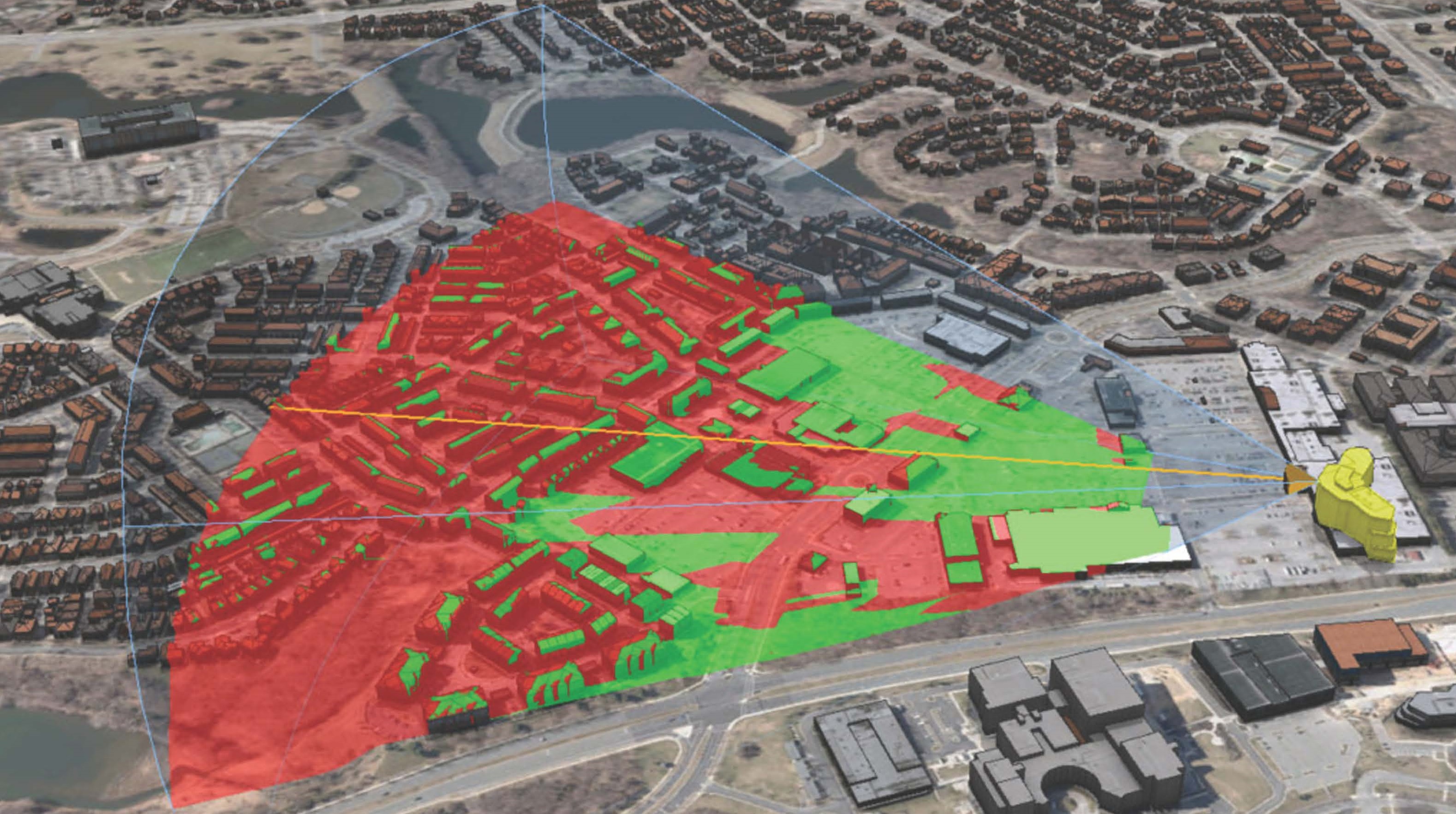
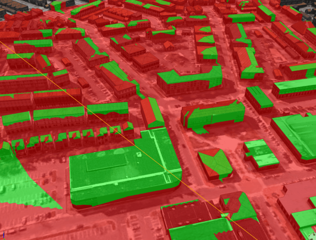
Viewsheds and site-lines can also be calculated in GIS, as all building models are constructed from either highly accurate geolocated LiDAR information or detailed architectural specifications. This helps pinpoint which existing structures may have their views impacted (shown in green), and so may required additional targeted public outreach before construction begins.

impacted views

Are you planning a new development, want to explore digital 3D data, or need to have your own virtual world built? Let us know, SymGEO is here to help!

Building a Digital City

I was recently asked by a friend in the commercial real estate industry if SymGEO could build a digital representation of Dallas. At the time I was pretty sure we could, based on available data, technology, and 3D modelling experience. However, as we all know in this fast-moving tech-focused industry, being “pretty sure” is a dangerous position, so today was the day to find out.

Our journey started with finding building footprints, which the City of Dallas has made available for download based on 2009 aerial photography. Fortunately, wide-area LiDAR with approximately 1 meter spacing was also collected at the same time and made available through TNRIS. This high-density survey method gave a blanket of point elevations, which are then used to derive digital terrain models (ground), and digital surface models (buildings and trees). When combined with building footprints, these are the best ingredients for a 3D city model.

The next step was to run a series of scripts and tasks within ArcGIS Pro to determine the average height of each building and whether the roofs were sloped or flat. This gave great preliminary results, but due to the complex roofs in the downtown area, some generalization errors were introduced into the model, as each footprint could only have a single height associated with it. These errors can be quickly spotted by buildings that either have LiDAR points above the building envelope (circled in black), or a building envelope above the LiDAR points (circled in white).

Fortunately, due to the relative ease of spotting errors, the building footprints could be quickly modified to break them up based on the roof components to give multiple heights per footprint.

Interestingly enough, several footprint displacement errors were also discovered in the city-provided data during this process, so those were fixed at the same time. After several hours of fixing and segmenting footprints, the scripts were run again to re-calculate the buildings. Needless to say, it was easy and gratifying to see the rapid improvements in the model.

Finally, we brought the model into Esri’s CityEngine to give it a little color. When the digital dust settled, a fine looking model of Dallas emerged. See below, with a similar view of downtown Dallas from Google shown for comparative purposes.

Are you interested in having a digital city built, or would like to find out what else can be done with 3D modeling?

Let us know, as we’re here to help, and “Yes, we can build a digital city.”

March News 2018

It’s been an amazing second month since launch, and we’re happily rolling out project examples of our services and pushing the boundaries of technology. We were also honored to be selected for Esri’s Emerging Business Partner program, and appreciate the faith Esri has in our abilities. Follow us on Twitter or LinkedIn to stay in the know, as it’s an exciting world out there!


We have developed a state-of-the-art 3D building visualization workflow, designed to bring existing or proposed buildings to life. Fully immersive exploration options are guaranteed to add the wow-factor to your presentations.

Read more


We pushed the boundaries of both cartography and dashboards with the US Income explorer, designed to show the sharp geographic divides in neighborhood area characteristics.

Read more


Drought in California impacts the $20+ billion dollar agricultural industry. We leveraged near-real time satellite-derived drought data to find out exactly which crops were at risk for an example county.

Read more


Efficient asset management is a snap when you bring the right data together with configurable application technology, as shown by our stormwater management work in Washington DC.

Read more


Crop Drought Status in California

SymGEO is pleased to share a glimpse into what’s possible using near-real time satellite sensor data and the power of GIS to produce a Crop Drought Status dashboard. In this example, we have used vegetation drought status and intersected it with crop data for a county in California to determine which crop types and how many acres are at risk. The vegetation drought data is available on a weekly basis nation-wide at relatively fine granularity with approximately a one week production lag-time, so it provides a very current glimpse into the on-the-ground situation.

Crop Drought Status in California dashboard

This information could be used by farmers or irrigation districts for the planned allocation and distribution of water resources, leading to better decision for our agricultural industry. It could also provide insight into crop prices or forecast yields based on existing or modeled conditions.

The data was processed in ArcGIS Pro to convert the satellite data into usable classifications and then intersect the drought conditions with the crop type data. Be sure to learn more about how the processing was automated using Model Builder! Once processed and symbolized, the data was then published and hosted in ArcGIS online, from which the dashboard was constructed. Charts and numerical summaries update interactively based on the map window extents, and the two map views are synchronized to allow side-by-side comparison.

Check out the Crop Drought Status dashboard today and let us know what you think!

Stormwater BMPs in DC

Did you know that when heavy rain falls in an urban environment, most of it will run off the roads and buildings into concrete channels and quickly dump into streams and rivers? This “stormwater” can be very damaging, as all the water enters into the streams at virtually the same time, so channel erosion and water quality are serious concerns. In natural environments, the water is slowed down and filtered by things like trees, wetlands, soaking into the ground and moving through the landscape.

To help mimic the function of the natural environment, urban planners and municipal engineers construct stormwater “Best Management Practices” (or BMPs) to help filter and slow down the water on its way to the nearest stream. Stormwater BMPs may include structures such as reservoirs, green roofs, permeable pavement, filtering ponds, or rainwater harvesting among others.

Keeping track of all those stormwater BMP assets is a challenge, so SymGEO has built the DC Stormwater BMP Manager to help. This configurable application uses an ArcGIS Dashboard template, and shows a select set of data attributes to display the characteristics and capabilities of local stormwater BMPs.

The data is coming directly from DC OCTO / DCGIS data servers, shared through Open Data DC. This powers the application with the authoritative data sets, and any updates to the data are immediately reflected in the manager dashboard. All statistics are calculated based on the stormwater BMPs within the view window, allowing interactive explorations around the city.

If only a certain subset of data is to be investigated (say by BMP type, or by green vs gray infrastructure), a left-hand panel can be opened to filter the data. All statistics and the map window are linked to those filters, and additional data about each BMP can be accessed by clicking on the BMP feature.

Give the DC Stormwater BMP Manager a spin, and imagine the possibilities using your own data. Contact us for more information on how to effectively display and share your digital assets!

US Income Explorer

Ever wonder where the earners live? Looking for that link between education and income? Want to see how your community stacks up against the neighbors? Use SymGEO’s US Income Explorer to visualize and explore American Community Survey data from the US Census Bureau combined with income and benefit data published by the Internal Revenue Service, all delightfully symbolized using a novel “firefly” cartographic style recently published by Esri.

income dashboard

As explained very eloquently by Lisa Berry, a Cartographic Product Engineer at Esri, the symbology for the ACS data tells a very visual story by showing the predominant category for each data point, proportionally sized to the number of reporting households, and then given the brightness according to how dominant that category is compared to the other categories.

There’s a lot of data being calculated interactively to summarize only what’s shown in the visible extent. This allows a comparison between different areas within a state or around the country to be achieved relatively easily. Clicking on the map points or county areas shows a pop-up with detailed data, allowing a deep dive into the characteristics of select areas. A number of different ACS data layers can be turned on or off using the “layer” stack icon in the map viewing window.

The sharp geographic divides in neighborhood area characteristics can be quite shocking, and hopefully the presentation of this aggregated data by SymGEO will lead to productive discussions on how communities can work together to lessen those differences.

3D Building Visualization

SymGEO is excited to share a peek behind the scenes into our cutting edge 3D building visualization products leveraging Esri CityEngine and a little post-processing magic. The end result is a virtual environment that can’t wait to be explored! Each building is generated from building mass information or building footprints. Textures are added based on zoning information and can be fully customized if building photography is available.

Once the existing environment is built out, the fun begins of playing “what-if” scenarios for proposed commercial or residential developments.

Full control over camera and environmental variables allows the presentation of 3D building data in the optimum light.

Video fly-over gives the ultimate in bird’s eye perspective and allows stakeholders full visibility into a proposed development.

Needless to say, this powerful combination of software makes compelling, cost-effective 3D building presentations a reality.

Check out our fun, promotional video on YouTube and let us know if your world is ready for this!

News for February, 2018

SymGEO News is designed to aggregate and share relevant and timely stories of geospatial data advances from around the web, and around the world. Knowledge sharing in this age of information is critical to advance the science – leading to better decisions and more insightful stories. Join us by subscribing, and share your story with our community!

News for February, 2018
SymGEO has launched a free interactive Global Water Risk Dashboard designed to help inform policy decisions around the world!

Read more


(Image from https://www.prepdata.org/)

PREPdata, an open-source platform, seeks to improve access to useful data and empower communities and businesses to better plan for and build climate resilience.

Read more


(Image courtesy of Wikimedia Commons/Ramkumar)

Water shortages cost Indian energy companies billions based on new research from Water Resources Institute.

Read more

Global Water Risk Dashboard

SymGEO is pleased to share a free and interactive Global Water Risk Dashboard to help inform policy decisions on water risk and spark international discussion around the world. Powered by Esri’s ArcGIS dashboard technology, this configurable application is based on population data provided by CIESIN, overall water risk data from Water Resources Institute, and country boundary data from GADM.

From WRI: “Overall water risk identifies areas with higher exposure to water-related risks and is an aggregated measure of all selected indicators from the Physical Quantity, Quality and Regulatory & Reputational Risk categories. Physical risks related to quantity identify areas of concern regarding water quantity (e.g. droughts or floods) that may impact short or long term water availability. Physical risks related to quality identify areas of concern regarding water quality that may impact short or long term water availability. Regulatory and reputational risks identify areas of concern regarding uncertainty in regulatory change, as well as conflicts with the public regarding water issues.”

These data sets can be explored in detail in the WRI’s Aqueduct application.

The data was processed in ArcGIS Pro to aggregate the number of people in each country by overall risk category using zonal statistics. Once processed and symbolized, the data was then published and hosted in ArcGIS online, from which the Operation Dashboard was constructed. Charts and numerical summaries update interactively based on the map window extents, and clicking on a country of interest reveals detailed overall water risk data for that country.

Check out the Global Water Risk Dashboard today and let us know what you think!

News for January, 2018

SymGEO News is designed to aggregate and share relevant and timely stories of geospatial data advances from around the web, and around the world. Knowledge sharing in this age of information is critical to advance the science – leading to better decisions and more insightful stories. Join us by subscribing, and share your story with our community!

News for January, 2018


Image courtesy of www.jct600.co.uk

Smart Cities are embracing GIS to solve problems ranging from traffic to bad landlords using location-driven analytics and ground truthing.

Read more


Image courtesy of World Resources Institute and The Nature Conservancy

Planting trees as a business model? Studies show reforestation companies are profitable and are making a measurable positive impact on the environment.

Read more


Image courtesy of Tokyoahead at English Wikipedia

Air pollution costs businesses millions in lost revenues as consumers are more likely to stay indoors.

Read more


Image courtesy of Strava Labs

Strava global heatmaps show secret military bases as part of their user analytics, leading to the realization that big data visualizations may cause privacy concerns.

Read more