Crop Drought Status in California

SymGEO is pleased to share a glimpse into what’s possible using near-real time satellite sensor data and the power of GIS to produce a Crop Drought Status dashboard. In this example, we have used vegetation drought status and intersected it with crop data for a county in California to determine which crop types and how many acres are at risk. The vegetation drought data is available on a weekly basis nation-wide at relatively fine granularity with approximately a one week production lag-time, so it provides a very current glimpse into the on-the-ground situation.

Crop Drought Status in California dashboard

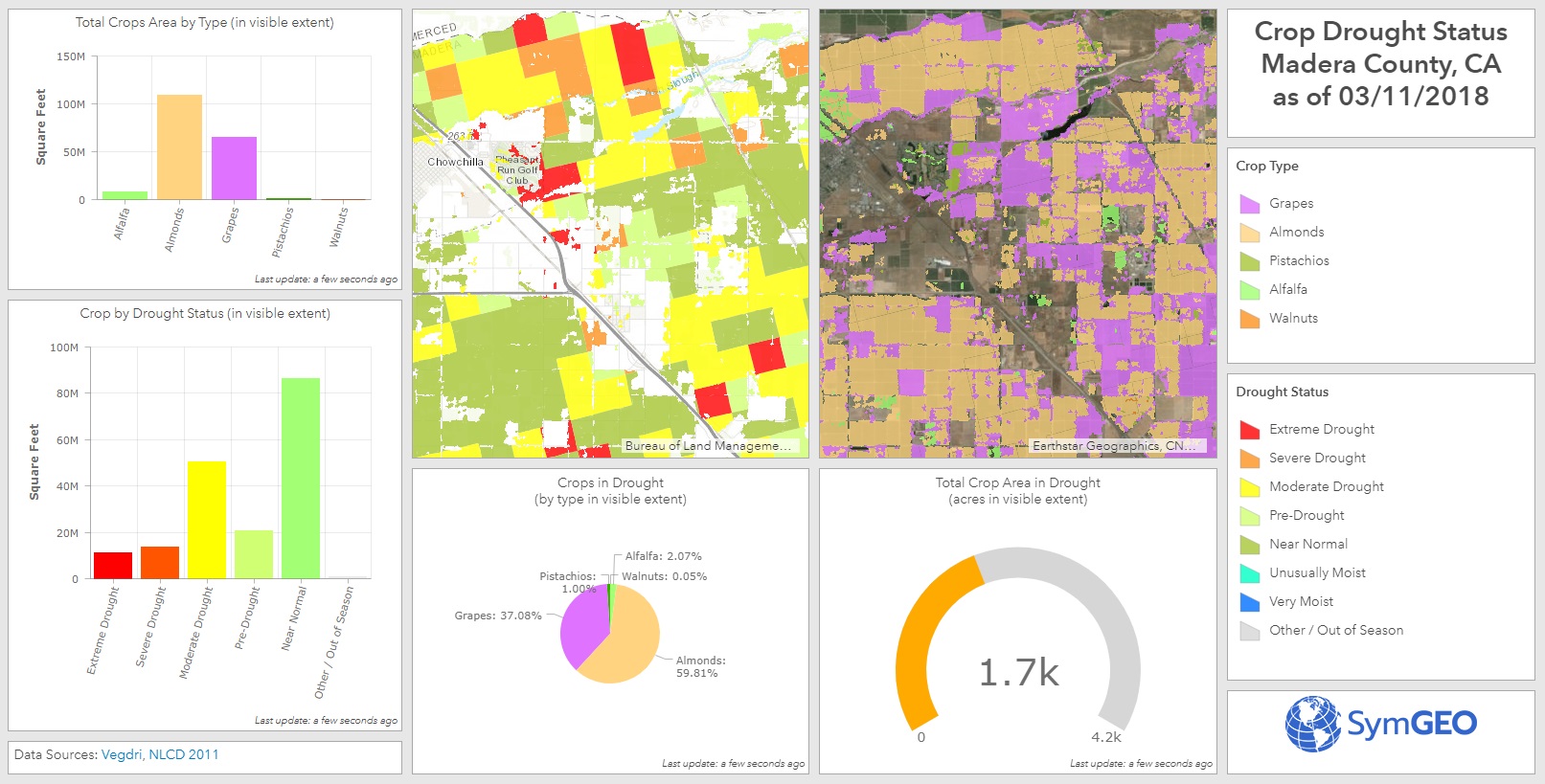
This information could be used by farmers or irrigation districts for the planned allocation and distribution of water resources, leading to better decision for our agricultural industry. It could also provide insight into crop prices or forecast yields based on existing or modeled conditions.

The data was processed in ArcGIS Pro to convert the satellite data into usable classifications and then intersect the drought conditions with the crop type data. Be sure to learn more about how the processing was automated using Model Builder! Once processed and symbolized, the data was then published and hosted in ArcGIS online, from which the dashboard was constructed. Charts and numerical summaries update interactively based on the map window extents, and the two map views are synchronized to allow side-by-side comparison.

Check out the Crop Drought Status dashboard today and let us know what you think!

Stormwater BMPs in DC

Did you know that when heavy rain falls in an urban environment, most of it will run off the roads and buildings into concrete channels and quickly dump into streams and rivers? This “stormwater” can be very damaging, as all the water enters into the streams at virtually the same time, so channel erosion and water quality are serious concerns. In natural environments, the water is slowed down and filtered by things like trees, wetlands, soaking into the ground and moving through the landscape.

To help mimic the function of the natural environment, urban planners and municipal engineers construct stormwater “Best Management Practices” (or BMPs) to help filter and slow down the water on its way to the nearest stream. Stormwater BMPs may include structures such as reservoirs, green roofs, permeable pavement, filtering ponds, or rainwater harvesting among others.

Keeping track of all those stormwater BMP assets is a challenge, so SymGEO has built the DC Stormwater BMP Manager to help. This configurable application uses an ArcGIS Dashboard template, and shows a select set of data attributes to display the characteristics and capabilities of local stormwater BMPs.

The data is coming directly from DC OCTO / DCGIS data servers, shared through Open Data DC. This powers the application with the authoritative data sets, and any updates to the data are immediately reflected in the manager dashboard. All statistics are calculated based on the stormwater BMPs within the view window, allowing interactive explorations around the city.

If only a certain subset of data is to be investigated (say by BMP type, or by green vs gray infrastructure), a left-hand panel can be opened to filter the data. All statistics and the map window are linked to those filters, and additional data about each BMP can be accessed by clicking on the BMP feature.

Give the DC Stormwater BMP Manager a spin, and imagine the possibilities using your own data. Contact us for more information on how to effectively display and share your digital assets!

US Income Explorer

Ever wonder where the earners live? Looking for that link between education and income? Want to see how your community stacks up against the neighbors? Use SymGEO’s US Income Explorer to visualize and explore American Community Survey data from the US Census Bureau combined with income and benefit data published by the Internal Revenue Service, all delightfully symbolized using a novel “firefly” cartographic style recently published by Esri.

income dashboard

As explained very eloquently by Lisa Berry, a Cartographic Product Engineer at Esri, the symbology for the ACS data tells a very visual story by showing the predominant category for each data point, proportionally sized to the number of reporting households, and then given the brightness according to how dominant that category is compared to the other categories.

There’s a lot of data being calculated interactively to summarize only what’s shown in the visible extent. This allows a comparison between different areas within a state or around the country to be achieved relatively easily. Clicking on the map points or county areas shows a pop-up with detailed data, allowing a deep dive into the characteristics of select areas. A number of different ACS data layers can be turned on or off using the “layer” stack icon in the map viewing window.

The sharp geographic divides in neighborhood area characteristics can be quite shocking, and hopefully the presentation of this aggregated data by SymGEO will lead to productive discussions on how communities can work together to lessen those differences.

Global Water Risk Dashboard

SymGEO is pleased to share a free and interactive Global Water Risk Dashboard to help inform policy decisions on water risk and spark international discussion around the world. Powered by Esri’s ArcGIS dashboard technology, this configurable application is based on population data provided by CIESIN, overall water risk data from Water Resources Institute, and country boundary data from GADM.

From WRI: “Overall water risk identifies areas with higher exposure to water-related risks and is an aggregated measure of all selected indicators from the Physical Quantity, Quality and Regulatory & Reputational Risk categories. Physical risks related to quantity identify areas of concern regarding water quantity (e.g. droughts or floods) that may impact short or long term water availability. Physical risks related to quality identify areas of concern regarding water quality that may impact short or long term water availability. Regulatory and reputational risks identify areas of concern regarding uncertainty in regulatory change, as well as conflicts with the public regarding water issues.”

These data sets can be explored in detail in the WRI’s Aqueduct application.

The data was processed in ArcGIS Pro to aggregate the number of people in each country by overall risk category using zonal statistics. Once processed and symbolized, the data was then published and hosted in ArcGIS online, from which the Operation Dashboard was constructed. Charts and numerical summaries update interactively based on the map window extents, and clicking on a country of interest reveals detailed overall water risk data for that country.

Check out the Global Water Risk Dashboard today and let us know what you think!