APTA Industry Footprint Update

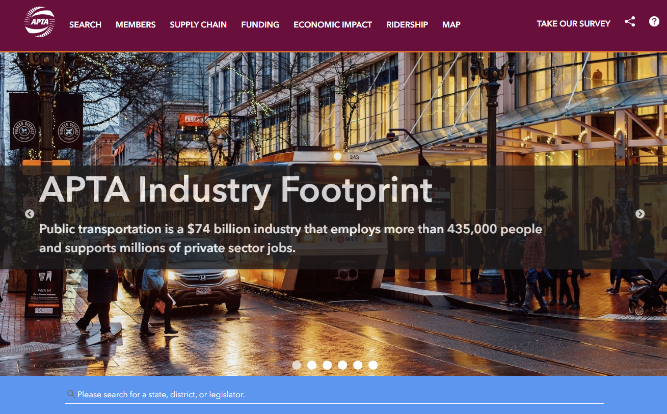
Public transportation is a $79 billion industry that employs 430,000 people and supports millions of private-sector jobs. As the public transportation industry advocacy leader, the American Public Transportation Association (APTA) is dependent on accurate, current data to help inform critical decisions of their nonprofit work. The newly updated Industry Footprint is designed to collect, analyze, and present key statistics at national, state, and local levels. This application, produced in collaboration with our development partners at GeoMarvel, provides insight into APTA membership, public transportation providers, transit service, manufacturing and supply chain, and congressional/legislative contact information. Learn more about all the innovative platform enhancements in the APTA Industry Footprint Storymap.


“The SymGEO team worked on a tight schedule to deliver a series of impressive updates and fixes to our existing application, including a whole visual re-imagining. We are excited to work on even more innovations to the tool going forward together.”

– APTA Senior Director, Policy Development and Research

Would a custom mapping application like this be useful to your organization? Talk to our solution experts today about your unique GIS needs, the SymGEO team is here to help!

APTA’s New Industry Footprint Platform

Public transportation is a $74 billion industry that employs 435,000 people and supports millions of private-sector jobs. As the public transportation industry advocacy leader, the American Public Transportation Association (APTA) is dependent on accurate, current data to help inform critical decisions of their nonprofit work. The all-new Industry Footprint is designed to collect, analyze, and present key statistics at national, state, and local levels. This application, produced in collaboration with our development partners at GeoMarvel, provides insight into APTA membership, public transportation providers, transit service, manufacturing and supply chain, and congressional/legislative contact information.

“We are happy with the results of our partnership with SymGEO. They produced a website that equals our ambition and stature as an association.”

– APTA Director of Policy Research and Development

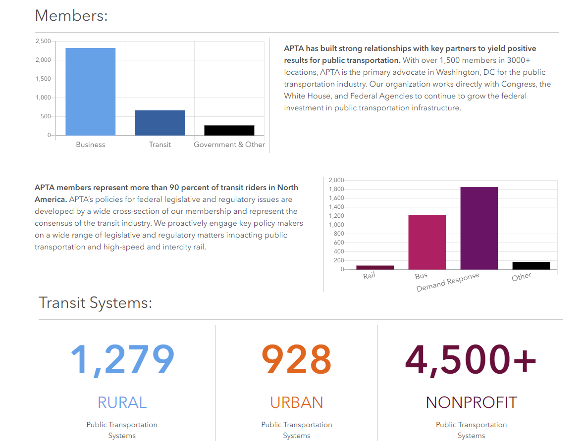
National-level statistics and APTA membership overview are provided on the homepage of the Footprint platform. Navigation links in the header help direct the audience to the section of interest. The top-level summary narrative for each section explains the importance of that component. Search functionality enables the audience to find a person, state, or legislative district of interest. Upon search, the local infographic “map” section is opened to explore in greater detail.

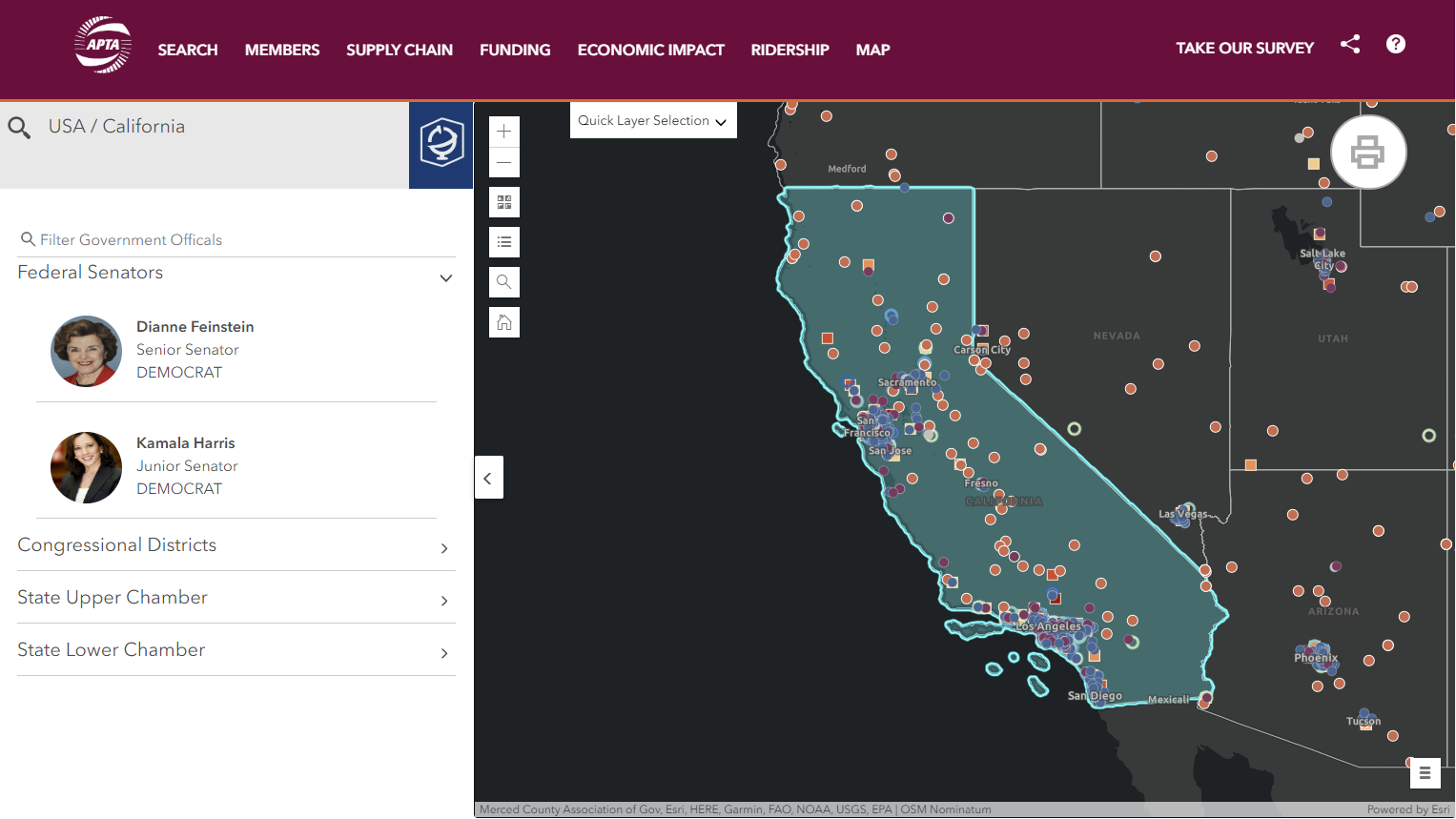
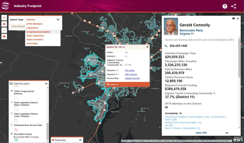
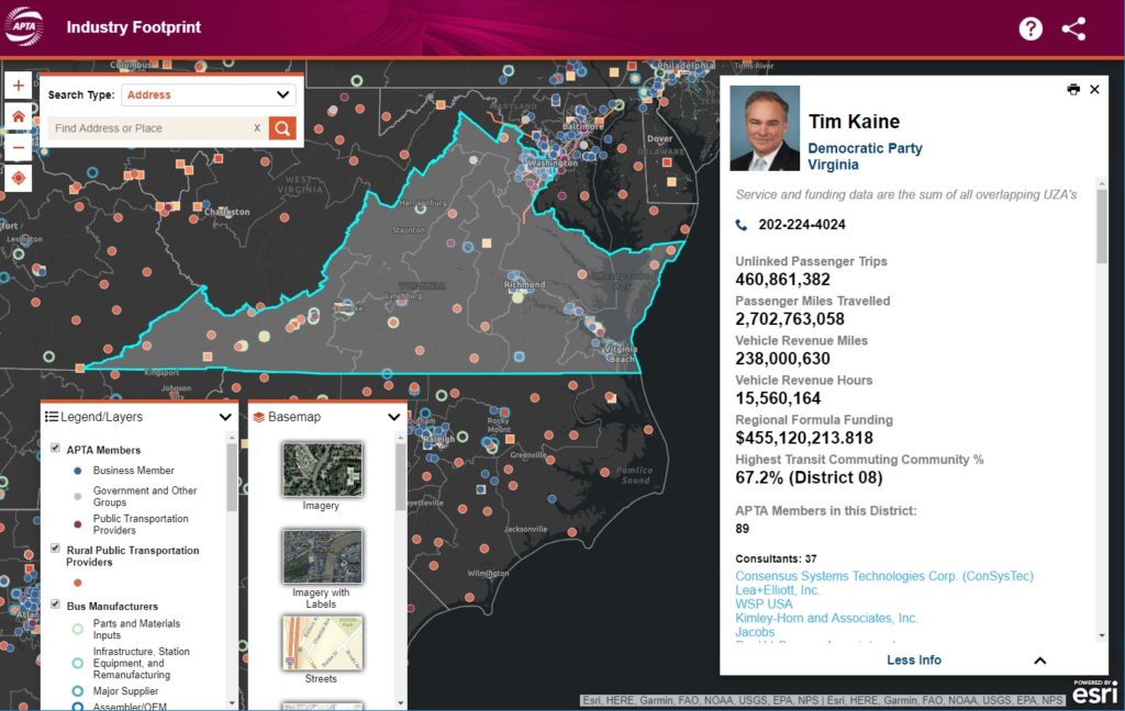
Search functional is enabled for legislators, states, APTA members, and committees in the upper-left corner. Selecting a search result will update the map with the associated geographic area and associated statistics. Map controls include the ability to turn on or off layers of interest, search for a location, switch the basemap, and zoom controls. Quick layer selection is provided to switch between state, congressional, or legislative geographies.

If a state is selected or the map is clicked upon, legislative information opens in the left-hand panel. This searchable section provides easy access to contact information for policymakers throughout the nation.

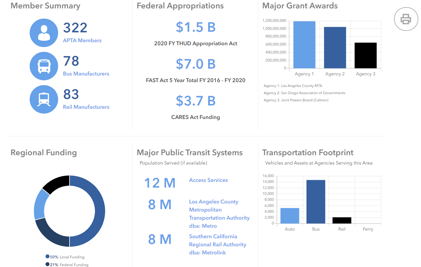
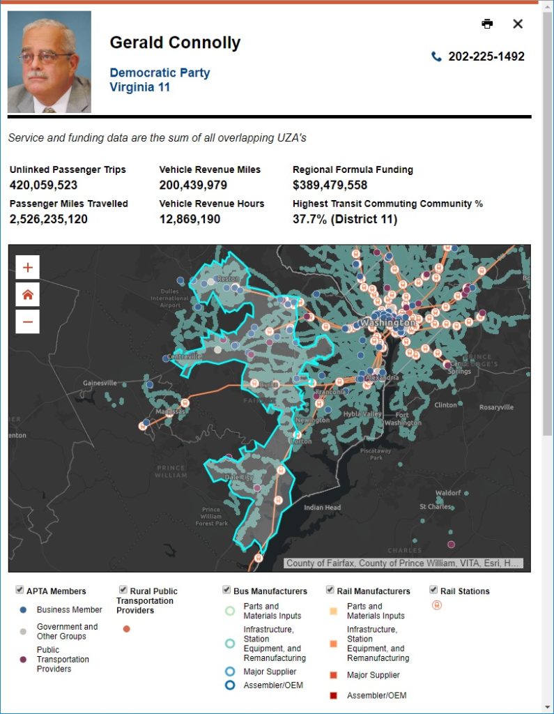
Upon selection of a search result or clicking on a map area, statistics and summary infographics are generated to help characterize the geographic selection. This information is compiled in a print-ready format, designed to help inform and energize a policy discussion for that geographic area.

Would a custom mapping application like this be useful to your organization? Talk to our solution experts today about your unique GIS needs, the SymGEO team is here to help!
APTA Industry Footprint

The SymGEO team was honored to redesign the flagship custom mapping application for the American Public Transportation Association (APTA) called the Industry Footprint. This application is designed to explore APTA membership, public transportation providers, transit service, manufacturing and supply chain, and congressional / legislative information. There is a wealth of information packed into one application!

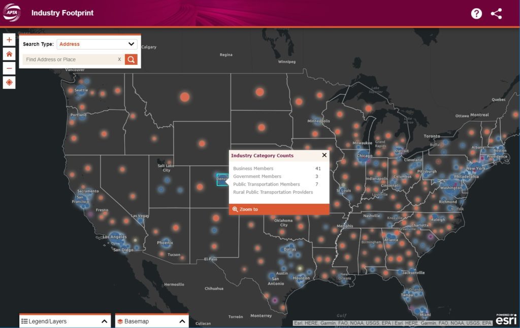
The newly modernized Industry Footprint first begins with a look at APTA membership and transportation provider data at the national scale. It’s not easy making intuitive sense of thousands of data points, but fortunately, there are visualization tools designed to help. SymGEO uses a novel cartographic predominance approach that shows the relative number of members and dominant industry category in each congressional district with a firefly symbology effect to give it a pleasing glow.

industry categories

“The SymGEO team worked on a tight schedule to deliver a series of impressive updates and fixes to our existing application, including a whole visual re-imagining. We are excited to work on even more innovations to the tool going forward together.”

–  APTA Senior Director, Policy Development and Research

State-wide information is provided upon zoom-in and includes details about the many APTA members, providers, bus and rail service areas, manufacturing supply chain, and legislative representative information. Most of these data sets required updates as part of this project, and several had broken over time as congressional data APIs had changed since the first version of this tool. This required extensive code logic updates and re-writes by our fantastic development partner, GeoMarvel, and included many stylistic and responsive updates to match the new modern design comps from our design partner.

statewide data

There are several search options available to help users find the information they are looking for and create the perfect map for their report or policy advocacy for their nonprofit work. For the detailed legislative information, users can locate their area of interest and select a congressional district or an upper / lower house state legislative district. Contact information is provided for the appropriate representative as well as a snap-shot of transit facts and membership data pertinent to that area.

congressional data

Print-ready interactive reports are also offered for the convenience of researchers who need to share their findings with others, either as digital pdfs or hard-copy prints.

printed report

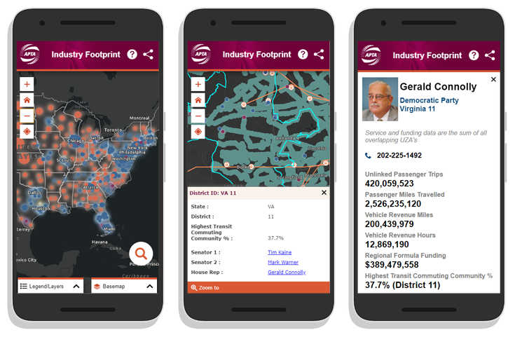
Finally, the application was redesigned for a fluid and responsive mobile experience. This allows data access on the go, in a meeting, or wherever needed.

APTA mobile

Talk to our mapping application experts today if you have an aging custom application that needs some modern TLC – the SymGEO team is here to help!
Local Government Solution: Citizen Problem Reporter

How great would it be to have a solution already developed for you and only some configuration is needed to roll it out? Today we look at the “Citizen Problem Reporter” solution developed by Esri to address a reoccurring need in local government.

Every local government has access to real-time, mobile sensors that travel throughout their jurisdiction on a daily basis. You guessed it, their citizens are their sensors! People notice issues left, right, and center. When armed with the right tools, people can be the eyes and ears of the community, giving near-instant notification of any concerns. These may range from dangers such as downed power-lines, or trash that wasn’t collected, or graffiti, or… the list goes on!

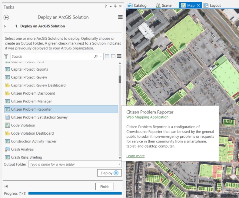
To help get the solution jump-started, Esri has developed a set of data and applications that fit together into a government’s ArcGIS online account.

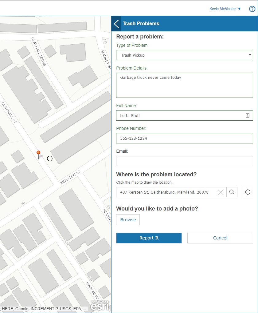
The solution includes an application that a citizen uses to report a problem through a fully mobile-responsive web interface. Great for easy access on the go!

citizen reporter application

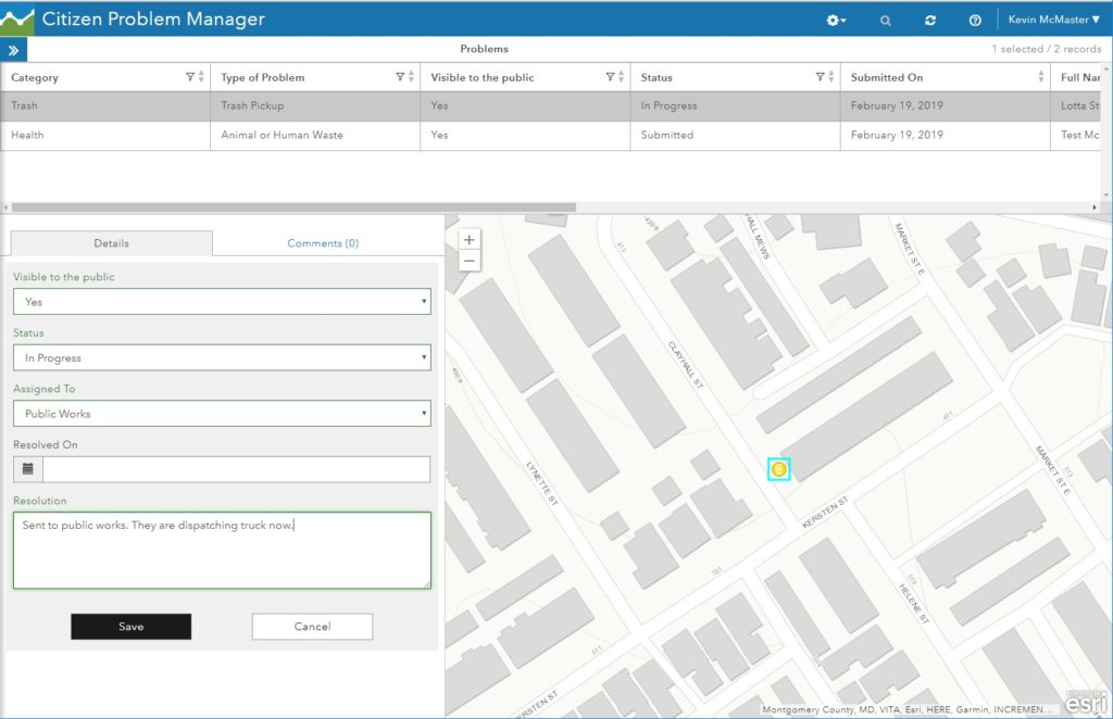
Once reported, the citizen problem manager sees all the issues using a separate application. They will route the issue to the appropriate department, add notes, and update the resolution status.

citizen problem manager

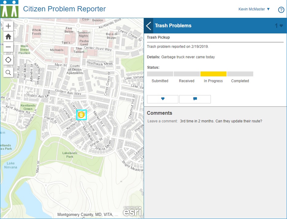
Citizens see the status of all issues through their application and know that they are being addressed. People can add notes, “up-vote” an issue, and make it into a social media platform if desired.

citizen problem reporter social

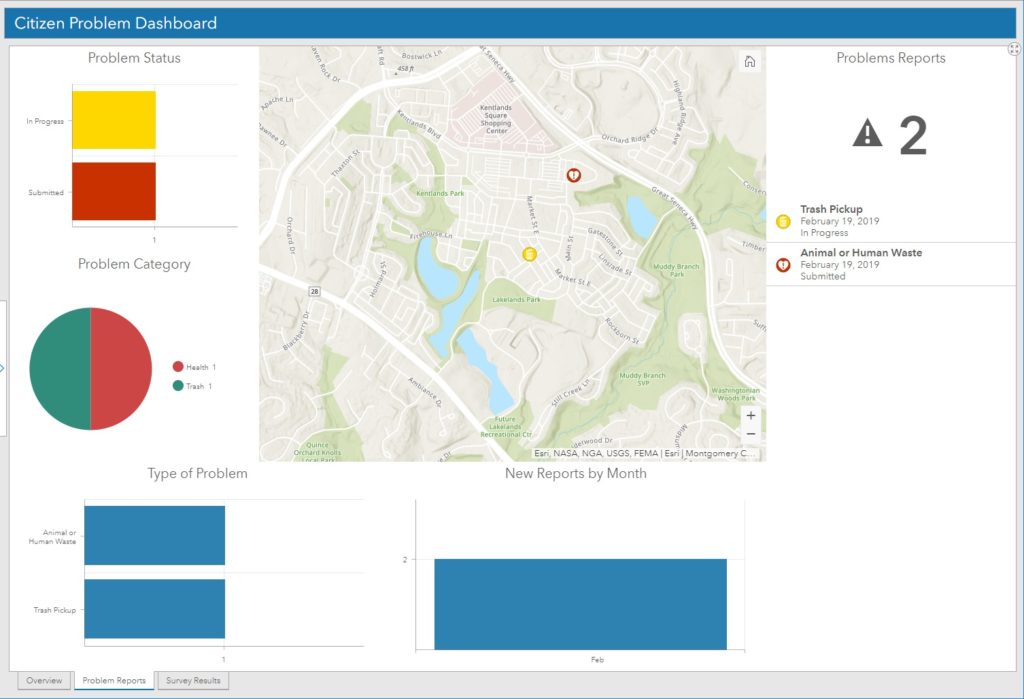
On the manager side, a dashboard keeps track of all issues that have been recently submitted. This helps to spot trends and identify departments that may need extra resources to address the needs.

issue dashboard

A statistical component of the dashboard keeps track of the requests over time and displays the status of all requests.

issue dashboard status

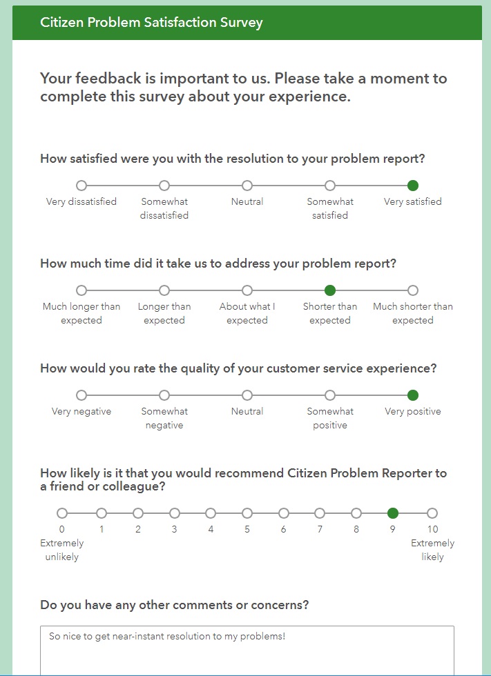
Optionally, a survey can be sent to the citizen who reported the issue to help close the loop and keep them engaged with the process.

reporter survey

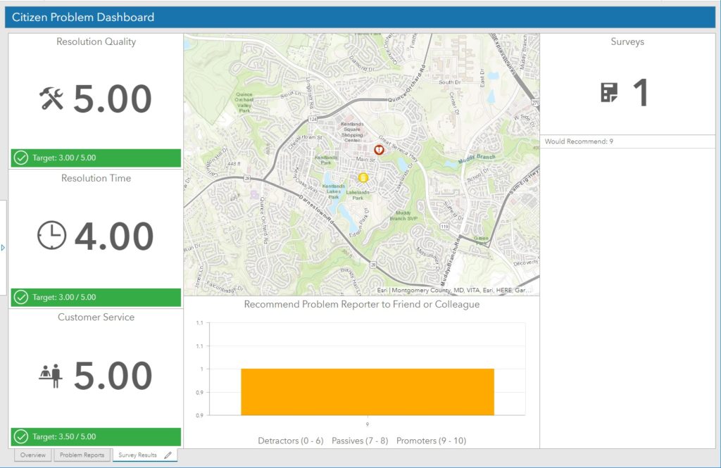
Finally, the manager dashboard also keeps track of survey responses. This is helpful to view perceived responsiveness of the department and show where improvement may be needed.

reporter survey dashboard

This local government solution is just one of many that have been pre-assembled and tested by Esri professional staff.

If you’d like help deploying this or other Esri Local Government Solutions, let SymGEO know, as we’re here to help!
 

Hurricane Tracker

With Hurricane Florence rapidly approaching the Carolinas, the scale and power of the storm was truly terrifying. From eye of the hurricane video, provided by the NOAA Hurricane Hunter (9 second mark below), to overhead imagery from NOAA showing the churning vortex, it was only a matter of time before the devastating effects of the hurricane would be felt.


Armed with Esri technology and the thirst for knowledge, SymGEO explored the Living Atlas of the World data sets until we found The National Digital Forecast Database (NDFD).

“The NDFD was designed to provide access to weather forecasts in digital form from a central location. The NDFD produces gridded forecasts of sensible weather elements. NDFD contains a seamless mosaic of digital forecasts from National Weather Service (NWS) field offices working in collaboration with the National Centers for Environmental Prediction (NCEP). All of these organizations are under the administration of the National Oceanic and Atmospheric Administration (NOAA). Wind Gust is the maximum 3-second wind speed (in knots) forecast to occur within a 2-minute interval at a height of 10 meters. Wind gust forecasts are valid at the top of the indicated hour. This feed consumes NDFD’s files and calculates the amount of forecast wind gust for the next 72 hours.”

– from NDFD metadata

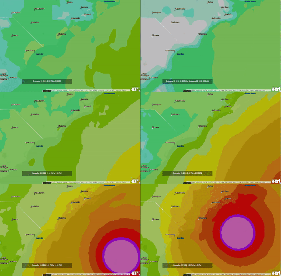
This information was explored in ArcGIS Online and showed the scale and timing of the expected hurricane landfall.

animated hurricane data

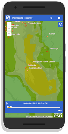
Finally, this data was wrapped in a time-aware, mobile responsive template in ArcGIS Online and tested to make sure it was pulling current data.

hurricane tracker phone

Check out the Hurricane Tracker today and let us know if you have an idea that SymGEO can help you with!

Sledding Locator

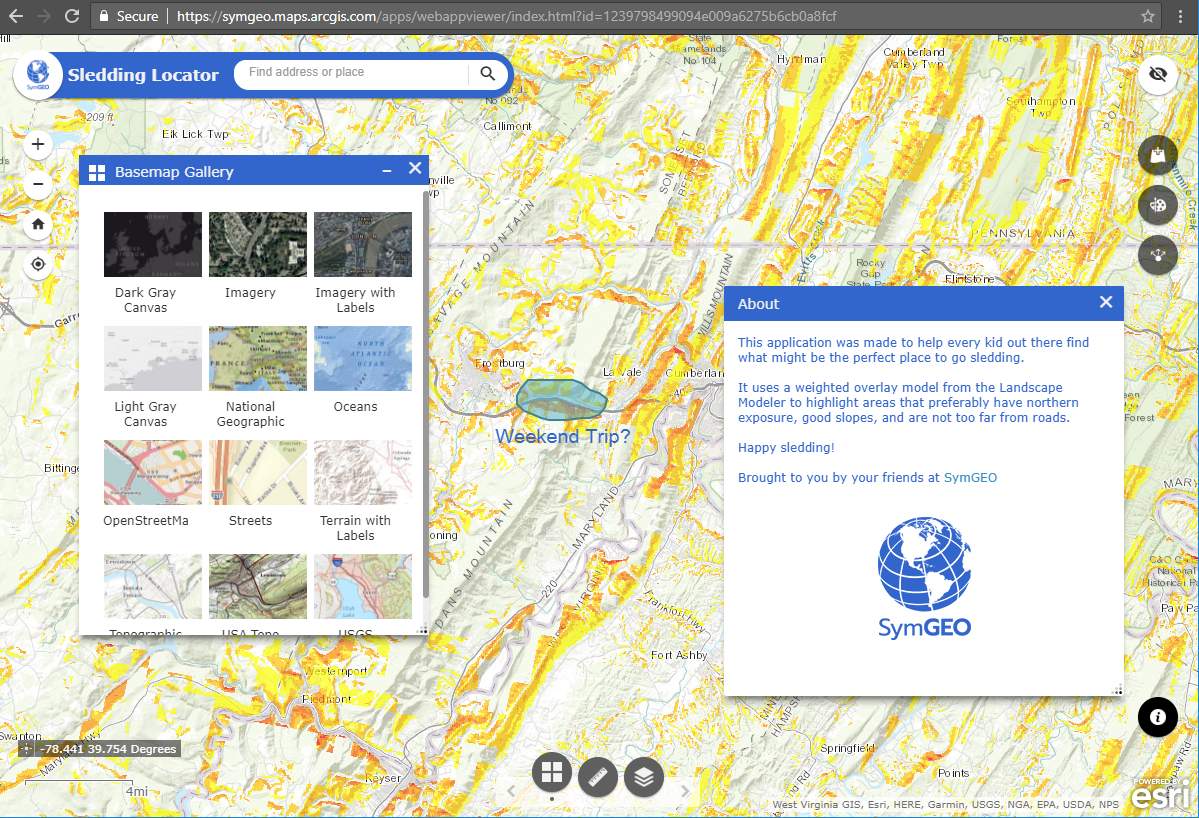
Sledding and July don’t usually go together, but what better time to plan out the winter’s adventures? This is the quintessential example of an idea that took 6 months to mature and then a few hours to accomplish, thanks to the power of Web AppBuilder and Landscape Modeler.

Like all great solutions, I was trying to do something else (boring technical details redacted), but happened on the Landscape Modeler which had most of the needed architecture already in place. By wrapping the model into an application configured using Web AppBuilder, the Sledding Locator was created in a matter of hours.

Sledding Locator

This application leverages a weighted raster overlay (WRO) model that specifically targets northern-facing sloped areas with roads in the general vicinity. When combined with some of the other basemap layers, particularly imagery to see if it’s relatively open lands, users will be able to tell if it’s worth scouting out for sledding potential following a snow-storm!

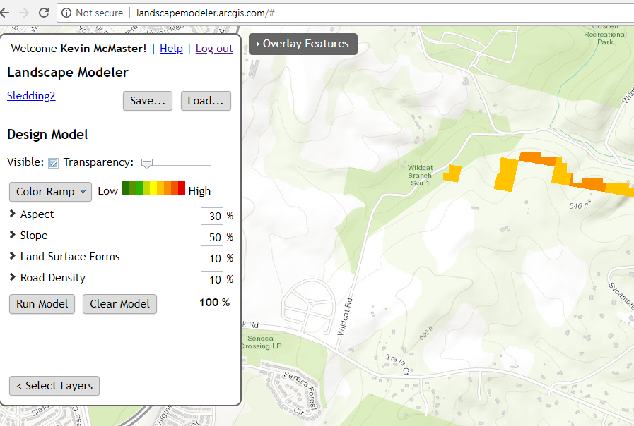
Landscape Modeler

From the technical Esri documentation: Weighted overlay has three conceptual steps. First, each raster layer is assigned a weight, as a percentage, in the analysis. This allows you to emphasize the relative importance of each layer in the analysis. Second, values within each raster layer are mapped to a common suitability scale. This allows you to compare the different types of information in each raster layer. Third, all raster layers in the analysis are overlaid. Each raster cell’s suitability value is multiplied by its layer weight and totaled with the values of other raster cells it overlays. The result is a suitability value that is used for symbology in the output raster layer.

Two input rasters have been reclassified

A number of other handy tools are included in this mobile responsive application so users can add their own data, add map annotations (drawings and text), or share the application with their friends.

Check it out today and let us know if you have an idea that SymGEO can help you with, or send us pictures of awesome hills you’ve found with the app!

Manage Your Workforce

Do you have a mobile workforce in charge of inspecting, maintaining or interacting with assets? Watering trees, inspecting signs, putting up flyers, or targeted fundraising activities? If so, there is a new technology from Esri called Workforce that has your name all over it.

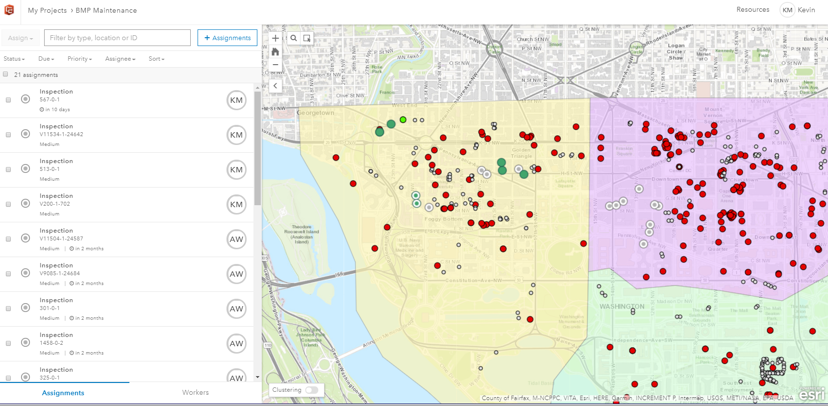
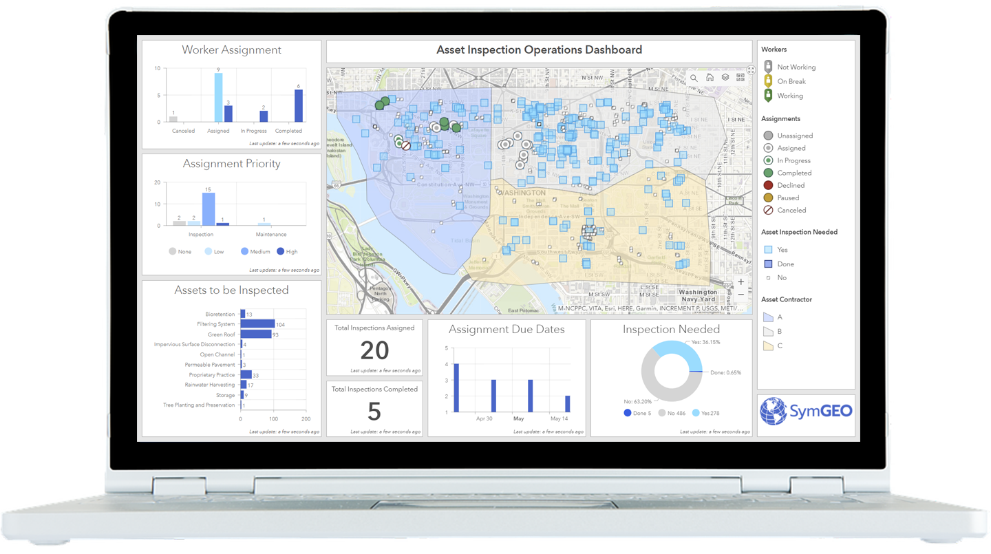
Beginning with asset data hosted in ArcGIS Online, a series of filters and queries can be used to determine which assets need to be assigned to your workforce. These might be assets over a certain age due for inspection, or locations where an issue has been reported. Assignments are made to named individuals in your ArcGIS organization, and contain information including location, priority level and due dates.

workforce project

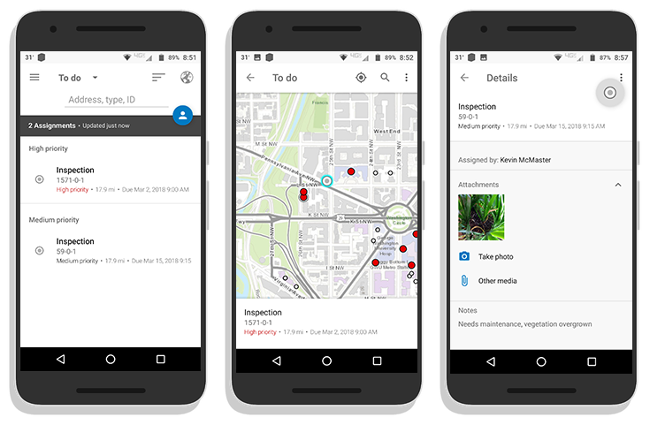
The assignments are then pushed to the mobile devices of your workforce, where they accept, navigate to, and complete the assignments. This may entail entering in notes, or taking pictures, and updating the assignment status. This information is sent back to the centralized cloud-based ArcGIS Online database in near real-time in a connected environment, or upon data synchronization if out of cell / wi-fi range.

workforce phones

Back in the office, the workforce administrator can use the information to check worker progress, see current worker status and location, and re-allocate resources if needed. The information is easily aggregated and displayed using a dashboard or configurable web application.

If you’d like a hand getting set up, let us know, and SymGEO will put Workforce to work for you!