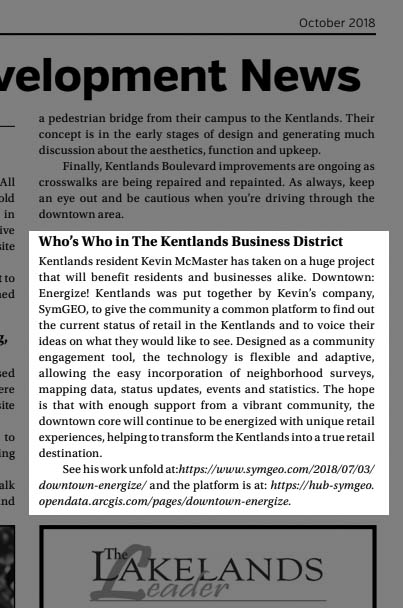
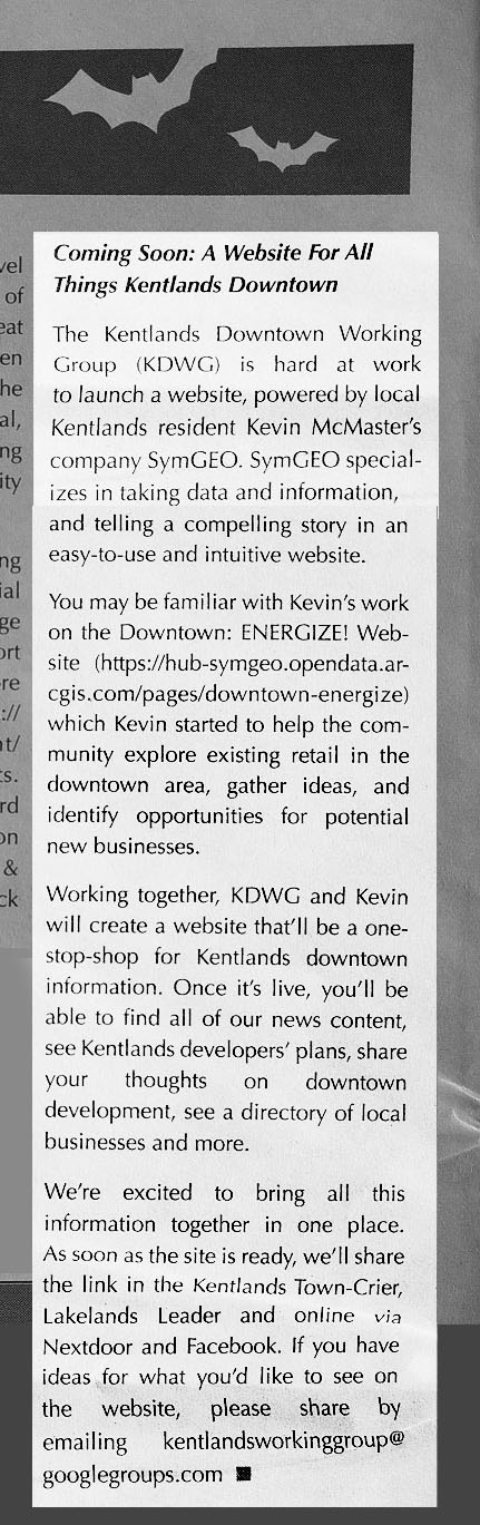
This month we were honored to have Downtown: Energize! featured in two local papers. There has been tremendous energy and enthusiasm swirling around this flagship project from SymGEO, and the technology continues to improve with every update.
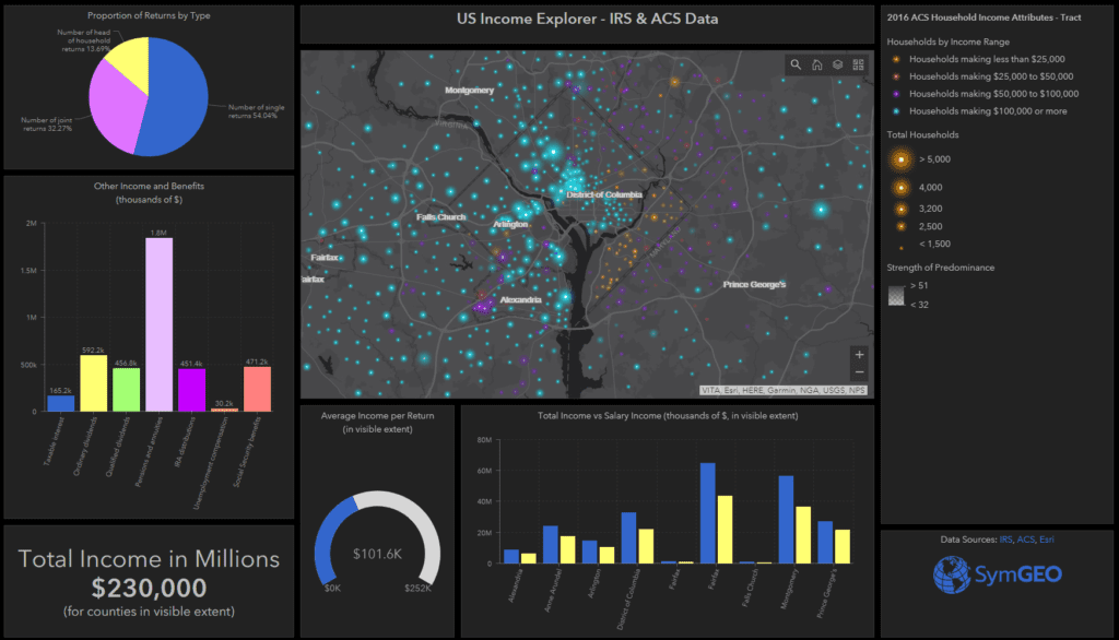
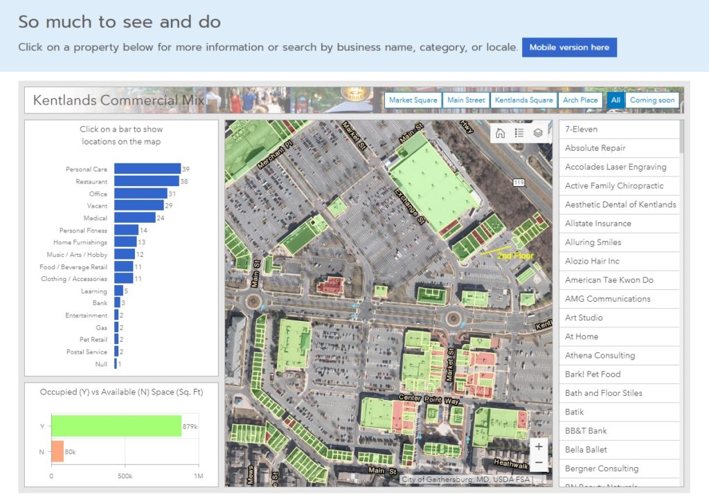
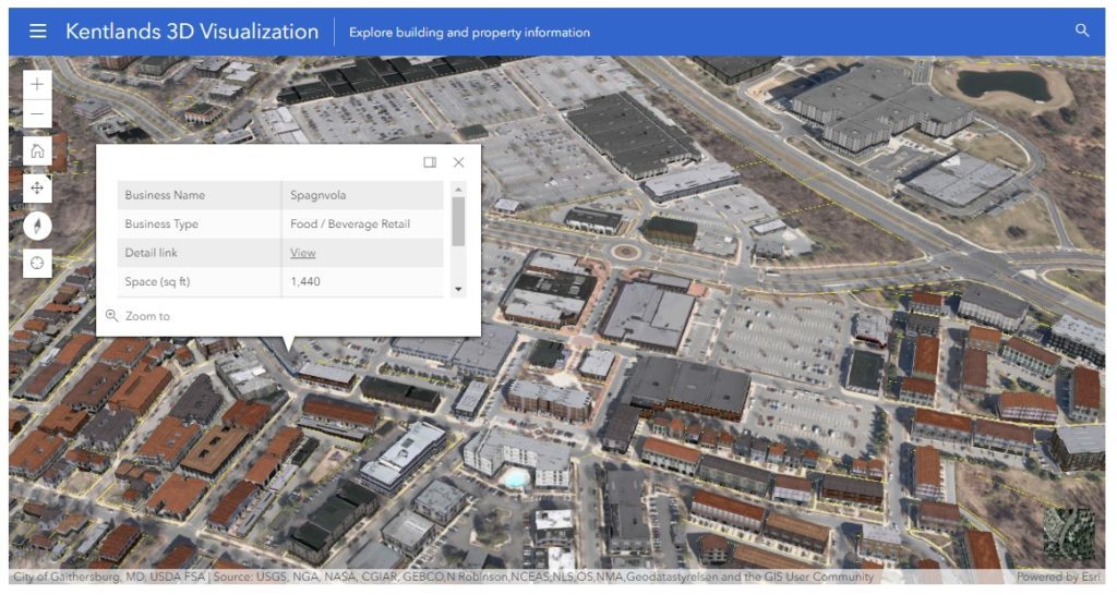
Downtown: Energize! features many different components of the ArcGIS technology suite, including Survey123, GeoForm / Collector, ArcGIS Dashboard, Web AppBuilder for the retail locator, and a web scene that uses CityEngine textured models derived from building footprints and Lidar information processed in ArcGIS Pro. These components are then hosted in ArcGIS Online and leveraged using ArcGIS Hub technology.
Two local development boards, the Kentlands Downtown Working Group (KDWG) and the One Main Street Initiative (OMSI), took an excited interest in Downtown: Energize! and have commissioned complimentary sites to be built using Hub technology. The commercial real-estate management of the site is especially useful in a fast-paced environment!
“The KDWG was commissioned by the Kentlands board to provide accurate and timely information on the various development efforts going on with our downtown so residents can be better informed and take a more active role in improving our community. We chose the Downtown: Energize! platform developed by SymGEO with its innovative digital mapping because it helps do exactly that.”
– John Ingrassia, Chair, Kentlands Downtown Working Group
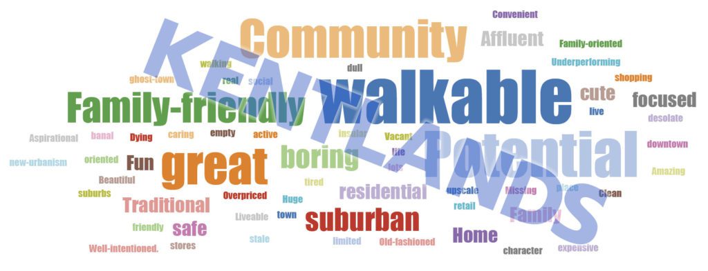
“A great commercial district is a huge amenity for our community. Downtown: Energize! is a great digital tool for helping the community achieve the vision for our commercial district. Not only will it help us engage the community to provide flexible two-way dialogue, but it will help us by mapping opportunities where businesses can expand and thrive. This innovative platform will allow us to easily update data, access data and provide data well beyond our community, which provides outreach to businesses looking to expand. Additionally, it is a fun way to empower consumers looking for a place to spend their precious free time to engage with this easy to use tool whether at home or mobile. Working with Kevin at SymGEO has been an amazing experience. He and his team are bringing tremendous innovations and ideas to our team at The One Mainstreet Initiative.”
– Neil Burka, Chair, One Main Street Initiative
“I was so excited when SymGEO came to us with this idea. As a local real estate agent and resident who is deeply engaged in the community, I understand on a personal level how important this spatial data is to get the community engaged and onboard with what’s happening. This platform will make it easy to access the data – especially for folks who, like me, are more visual.”
– Sheena Saydam, Realtor, Keller Williams Capital Properties, Member, Kentlands Downtown Working Group
“Downtown: Energize! as created by Kevin McMaster using the SymGEO platform, is an innovative digital tool that provides mapping of business locations to potential and existing customers in a format that is fun, easy to use, and flexible enough to accept updates and even track current events. It’s a win-win for our community by empowering residents to engage with our local businesses and to energize our downtown!”
– Ingrid L. Fraley, Local Business Owner – Design Services, Inc.
If you’d like to join the party with a Downtown: Energize! initiative, let us know as SymGEO is here to help!